Have Tour de France riders gotten faster over time?
The Tour de France bicycle race is 100 years old. One would think that with improvements in technology, nutrition, and training, TdF race times would have decreased. Is this true?
Ideally, we would compare times over identical stages across years, but the race route changes from year to year, and I can't find detailed information with the stage times. So this is all an approximation based on the the winner's total race time. It's also an example of simple page scrapping and analytics using R.
library(XML)
library(ggplot2)

## scrape their page
tdftab <- readHTMLTable("http://www.letour.fr/2012/TDF/HISTO/us/palmares.html")[[1]]

## convert from European format 123,4 to 123.4
tdfdist <- as.numeric(gsub(" ", "", gsub(",",".", tdftab[, 7], fixed=TRUE)))

## convert from 12h34'56" to decimal hours
tdftime <- sapply(strsplit(as.character(tdftab[, 8]), "h|'|\""),
                  function(l){ as.numeric(l) %*% c(3600, 60, 1) / 3600 } )

## calculate speed in mph
tdfdistmiles <- 0.62137 * tdfdist
tdfspeed <- tdfdistmiles / tdftime

## convert year factor into number
tdfyear <- as.integer(levels(tdftab[, 1]))[tdftab[, 1]]

## build data frame, compute the decade as factor
tdf <- data.frame(year = tdfyear, speed = tdfspeed, dist = tdfdistmiles,
                  decade = cut(tdfyear, breaks = seq(1900, 2020, by = 10),
                    dig.lab = 4))
First, let's look at the speed vs. year in a simple scatterplot.
qplot(year, speed, data = tdf) + geom_smooth(method = "lm", se = FALSE) +
  labs(title = "Tour de France winning race speeds by year",
       x = "Year", y = "Speed (mph)")
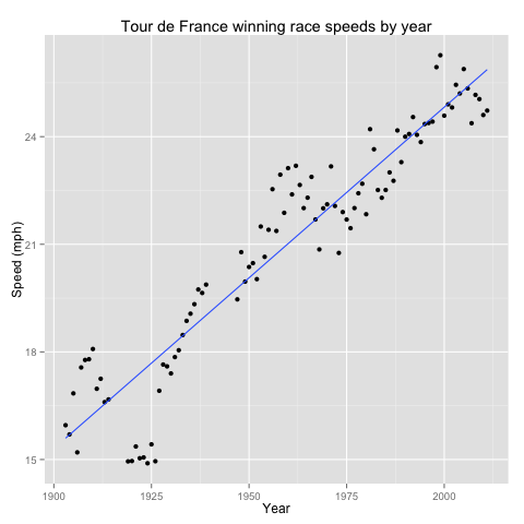
There is a rough linear relationship between year and speed—but this does not account for the shortening of races over time.
qplot(year, dist, data = tdf) + geom_smooth(method = "lm", se = FALSE) +
  labs(title = "Tour de France distance by year",
       x = "Year", y = "Distance (miles)")
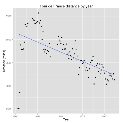
So, winning times have decreased over time, but so have the race distances. What has happened to speed as a function of distance?
outliers <- tdf[tdf$dist < 2000, ]
qplot(dist, speed, data = tdf, color = year) +
  labs(title = "Tour de France winning race speeds by distance and year",
       x = "Distance (miles)",
       y = "Speed (mph)") +
  annotate("text", x = 125 + outliers$dist, y = outliers$speed,
           label = as.character(outliers$year))
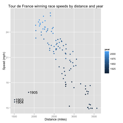
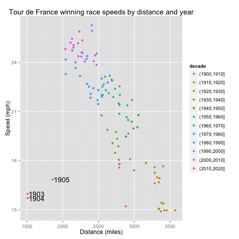
Here we see that even controlling for distance, the races have gotten faster. Also, the TdF early years were off to a slow start (literally). We can clean this graph up a little by mapping decade to a color spectrum.
qplot(dist, speed, data = tdf, color = decade) +
  labs(title = "Tour de France winning race speeds by distance and year",
       x = "Distance (miles)",
       y = "Speed (mph)") +
  annotate("text", x = 125 + outliers$dist, y = outliers$speed,
           label = as.character(outliers$year))
To make this quantitative, here's the multivariate linear regression.
lm(speed ~ dist + year, data = tdf)
Call:
lm(formula = speed ~ dist + year, data = tdf)

Coefficients:
(Intercept)         dist         year
 -1.452e+02   -1.085e-03    8.625e-02
So each additional year corresponds to an increase of 0.08625 mph, or 1.518 inches per second. Those inches add up! (Also, in the year 0, in races of length 0, they were bicycling backwards.)
I sent an earlier version of this analysis to Dan Russell. He redid it, and published on his blog. Readers there extended the analysis, pointed to others, and listed various conditions and quibbles about unmeasured variables that suggest caution interpreting these summary data. Still, it appears likely that riders have gotten faster over time.